
Transportation
Our identity
A symbol built
for movement
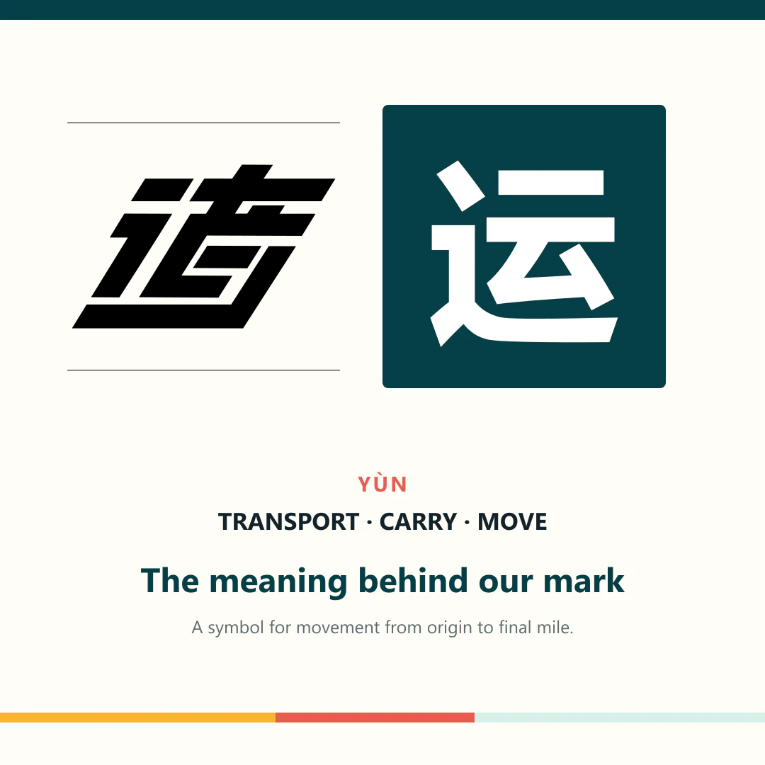
The Global Express Local mark is stylised from 运, a Chinese character closely connected with transport, carrying and movement.
Explore the meaning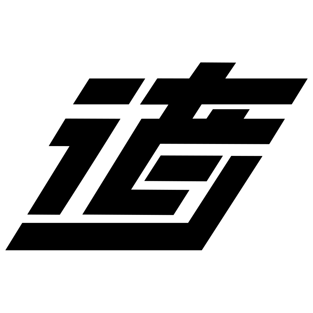
The source character
运
Yùn
Transport · carry · move
In logistics, 运 appears in words for transportation, freight and delivery. Its meaning connects the long international journey with the practical work of moving a parcel towards its destination.
Freight transport
To transport or deliver
Inside the character
Movement is part of its structure
The logo preserves the character's direction and balance while reducing its strokes into a bold mark that remains recognisable on a parcel, van or screen.
The movement radical
The sweeping left and lower stroke is associated with walking, travel and movement along a route.
The upper component
The stacked angular form supplies the upper structure and sound of the simplified character.
Forward momentum
The pronounced lean turns a written character into a mark that feels active, fast and purposeful.
One connected route
The continuous lower line reflects our role in carrying each shipment through to the final mile.
Our colours
Calm operations. Clear action.
The mark works in a single colour for clarity. Around it, our palette separates dependable delivery information from moments that need attention.
Deep teal
Trust, operational calm and clear visibility.
Signal amber
Movement, milestones and the next action.
Clear white
Clarity, space and information that is easy to scan.
The brand in motion
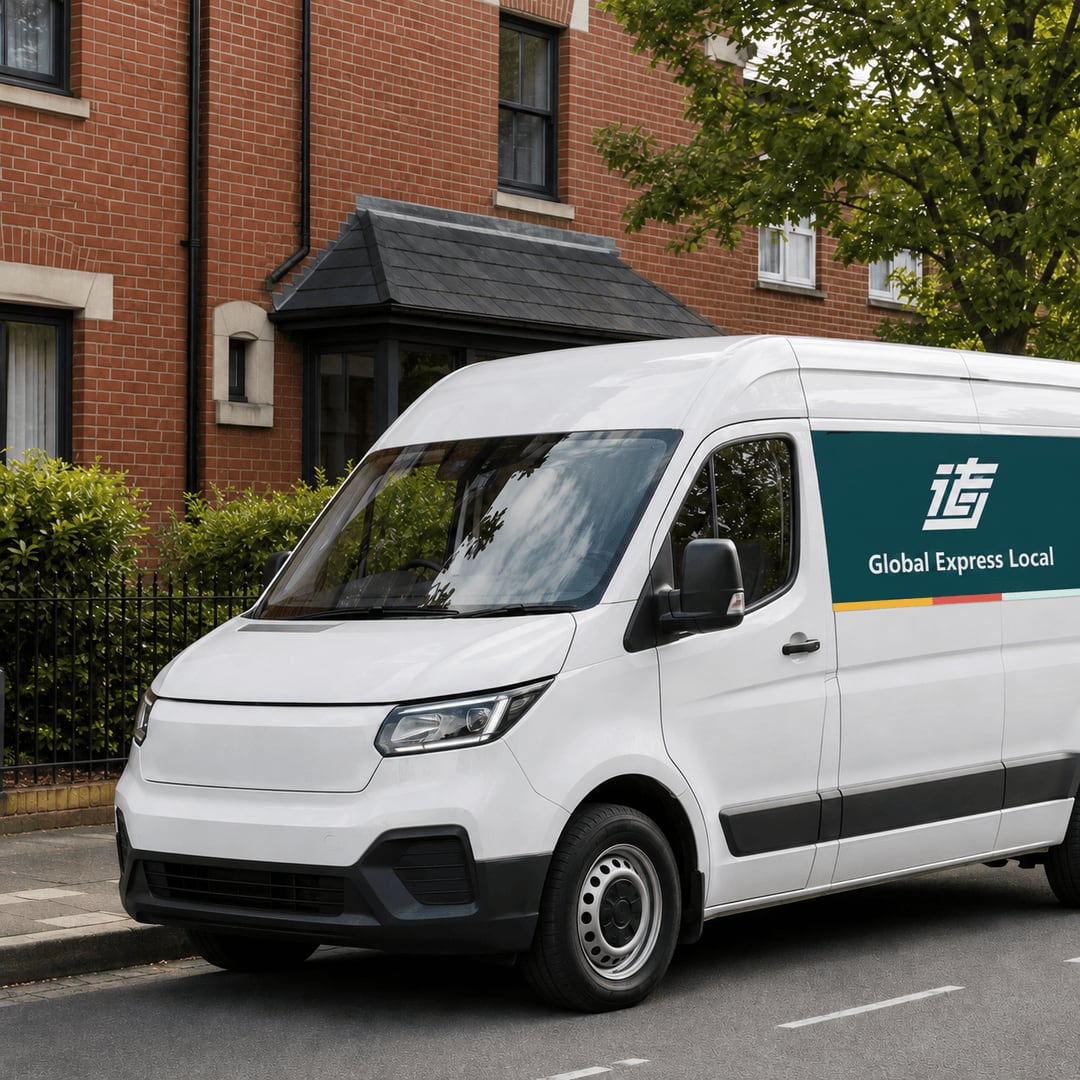
Designed to be recognised on the road.
The mark stays clear at vehicle scale, pairing the movement of 运 with a practical last-mile delivery identity. Deep teal provides visibility while the three-colour route line connects international movement with local delivery.
Brand image library
A consistent identity at every milestone.
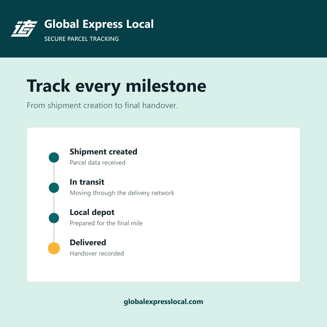
From international movement to local handover, each image uses the same recognisable mark, operational colours and clear delivery language.
The promise in the mark